Theravue Style Guide
Site Sections
Standard Public Pages
Public pages vary in formatting, as these pages were designs for marketing purposes. Classes can be added as needed.
Outer Container Classes:
<div class="public-content"></div>
Standard styling. White background. The first inner div of public-content sets the width for consistency across pages.
<div class="public-content bg-highlight-01"></div>
Adds a light blue background.
<div class="public-content bg-highlight-02"></div>
Adds a light orange graphical element to the background.
<div class="public-content bg-highlight-03"></div>
Adds a light orange background.
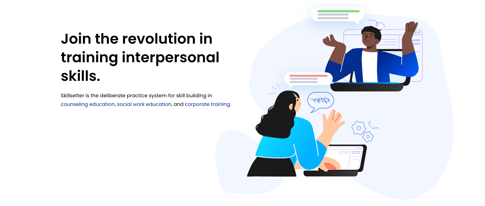
Generic Sections (Text + Image)
                    <div class="public-content">

                      <div class="row">

                        <div class="col-md-6 position-relative order-md-2">

                          <div class="position-md-absolute pl-md-5">

                            <h2>Header</h2>

                            <p>Text</p>

                          </div>

                        </div>


                        <div class="col-md-6 ">

                          <div class="img img-01"></div>

                        </div>

                      </div>

                    </div>
For code readability, text columns should always come before image columns when possible. Visual order of the columns can be set with the Bootstrap classes order-md-1 and order-md-2.
Images are set in pages.scss.css and media.scss.css. All homepage images should follow Retina image guidelines.
Centered Section:
                    <div class="public-content">

                      <div class="text-center">

                        <h2>Header</h2>

                        <p>Text</p>

                      </div>

                    </div>
Buttons
btn btn-primary
btn btn-outline-primary
Only the demo buttons should be filled in. Other buttons should be outlined in blue.
Usable Partials
"Used By" Carousel:
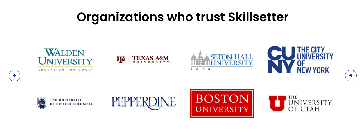
<%= render 'public_pages/usedby' %>
Uses Cards:
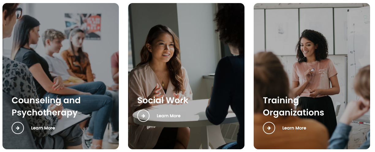
<%= render 'public_pages/uses_cards' %>
Testimonials:
<%= render 'public_pages/testimonials' %>
End of Page CTA:
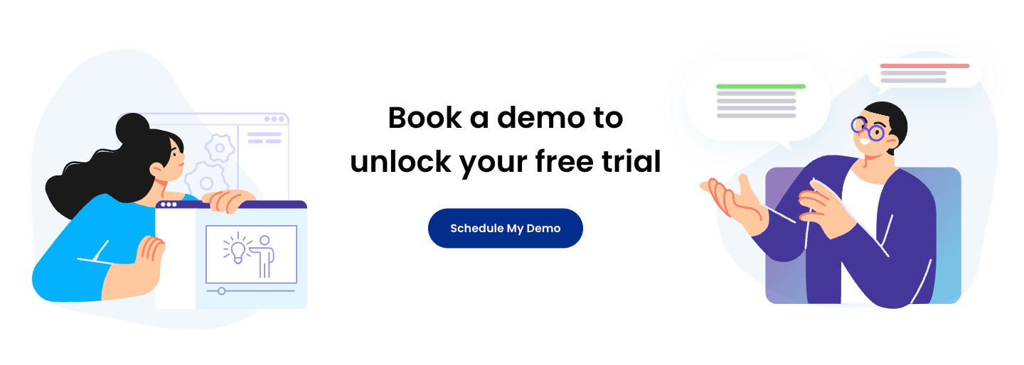
                    <% unless user_signed_in? %>

                      <%= render 'public_pages/cta' %>

                    <% end %>
All public pages (except the Demo page) render the CTA partial at the bottom of the page.
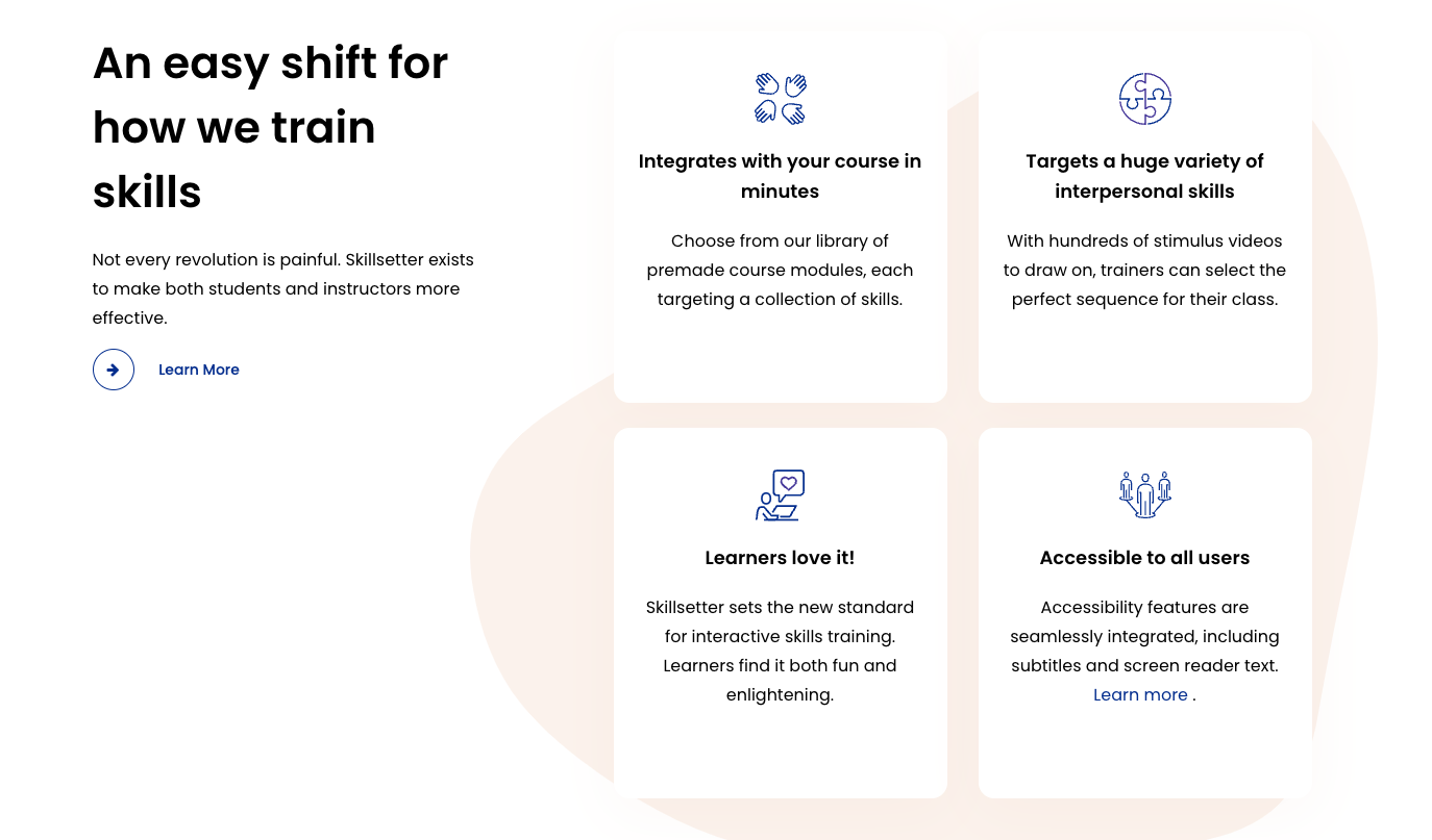
How It Works
Follows standard public pages layout.
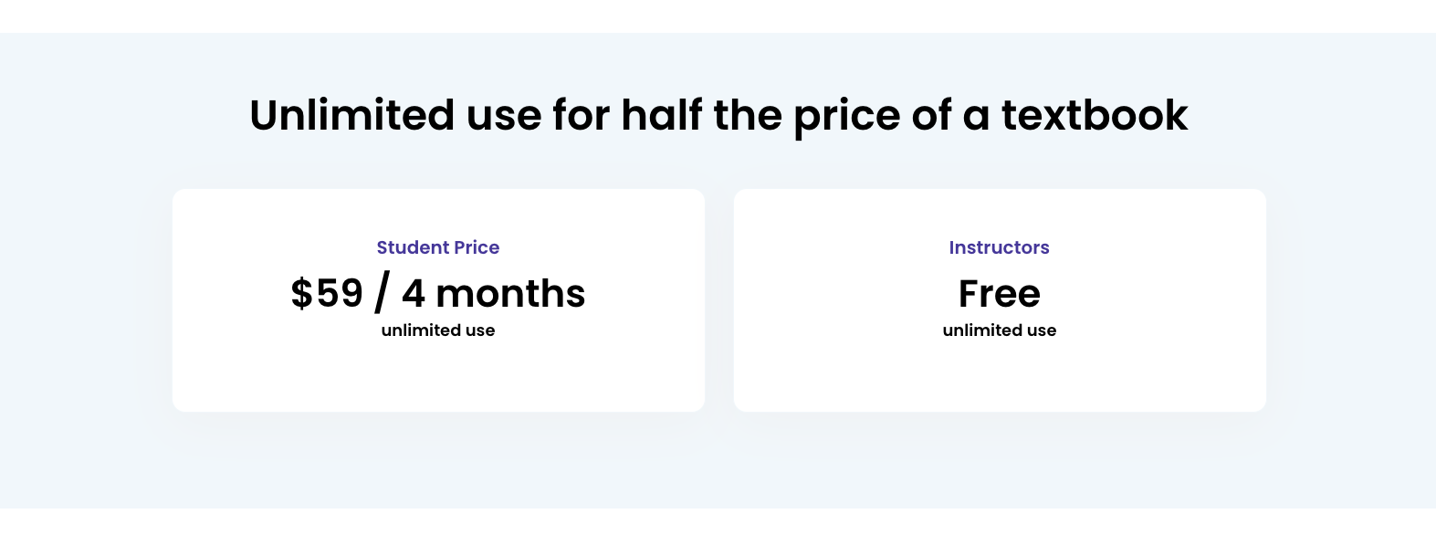
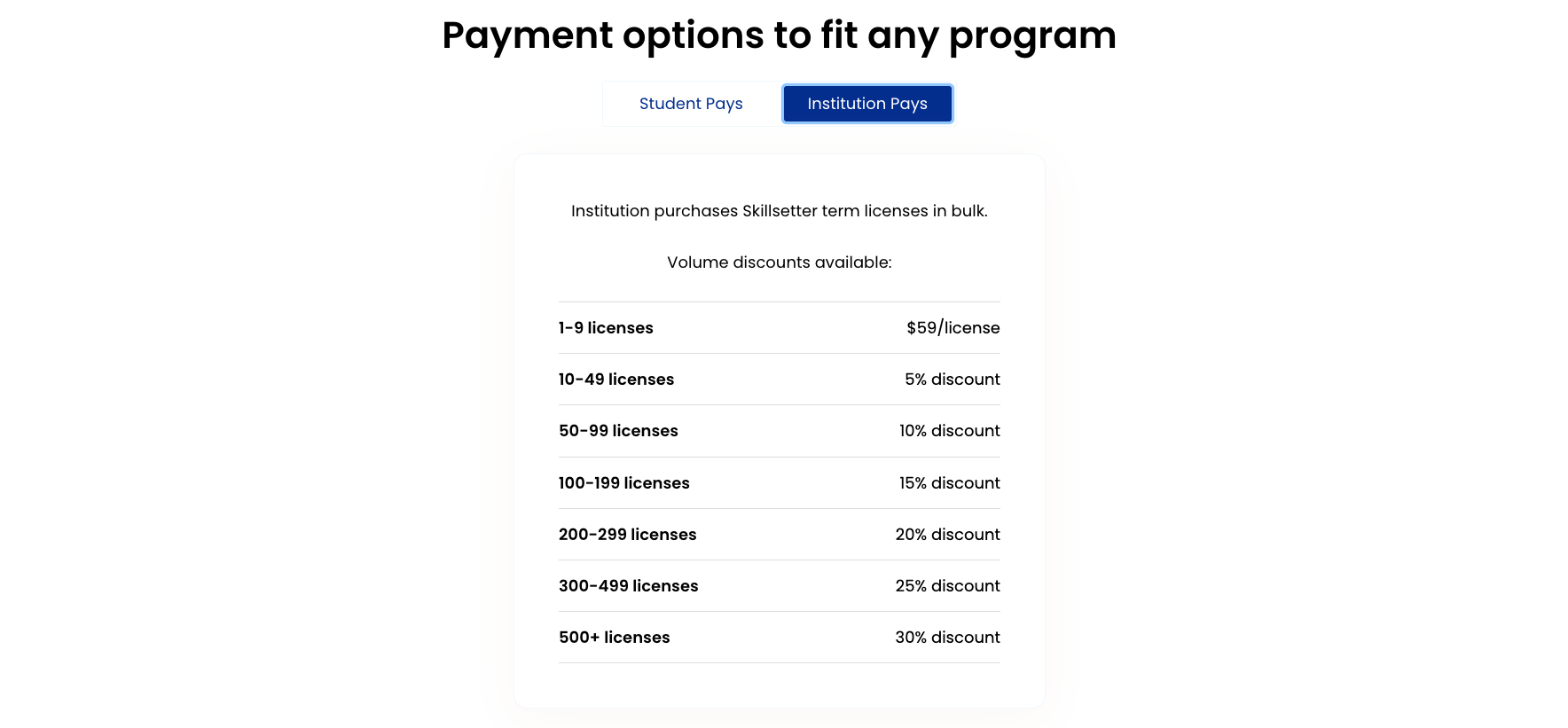
Pricing
Follows standard public pages layout.
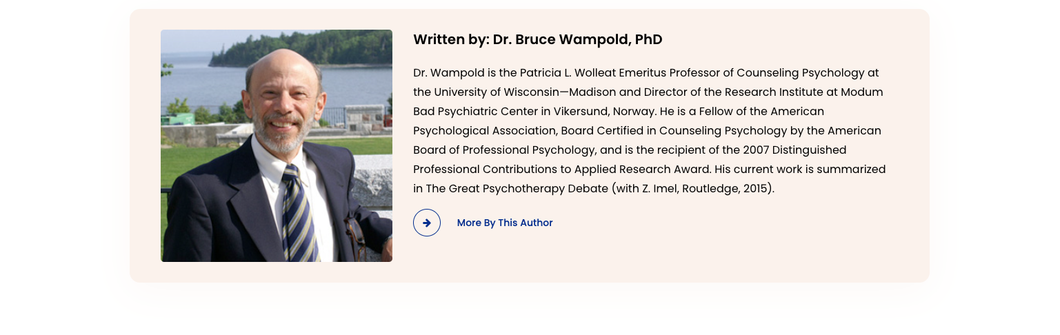
About
Follows standard public pages layout until staff listings.
Each person provides their own picture and description. This can be changed upon request.

Staff Listing Format:
                    <div class="staff clearfix">

                      <div class="staff-img firstname"></div>

                      <div class="bio">

                        <h3 class="h5">Firstname Lastname</h3>

                        <p>Title</p>

                        <p>Bio</p>

                      </div>

                    </div>
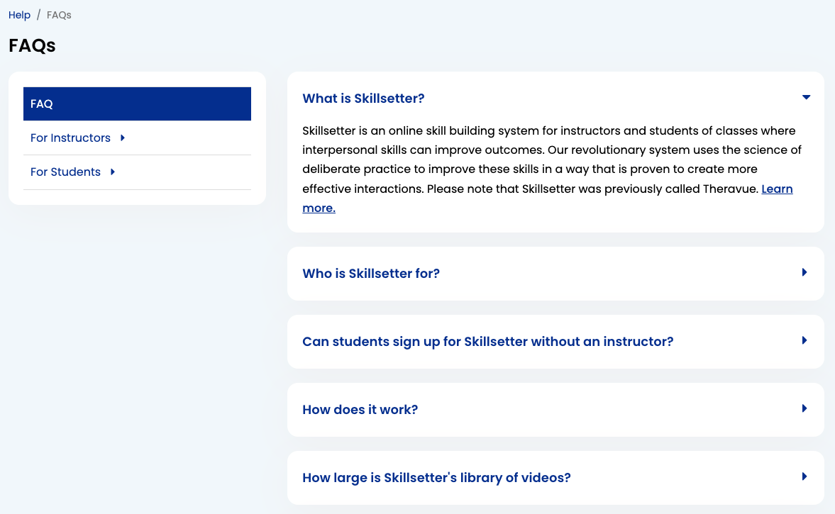
FAQ
Public Layout: Single Column
Authenticated Layout: 4-8. Help navigation on the left, content on the right.
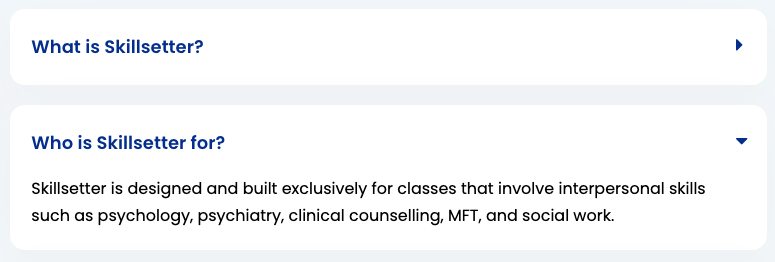
Listing of the core questions about the system. Also see Help Section.
Question Format:
                    <div class="contentbox">

                        <a class="question clearfix" data-toggle="collapse" href="#question-tag" role="button" aria-expanded="false" aria-controls="question-tag">

                          <h2>Question</h2>

                          <i class="fa" aria-hidden="true"></i>

                        </a>

                        <div id="question-tag" class="answer collapse">

                          <p>Answer</p>

                        </div>

                    </div>
Blog
Demo Scheduler
Follows standard public pages layout.
Login, Registration, etc
Layout: Full width. Content contained inside cards, with the exception of some extra links.
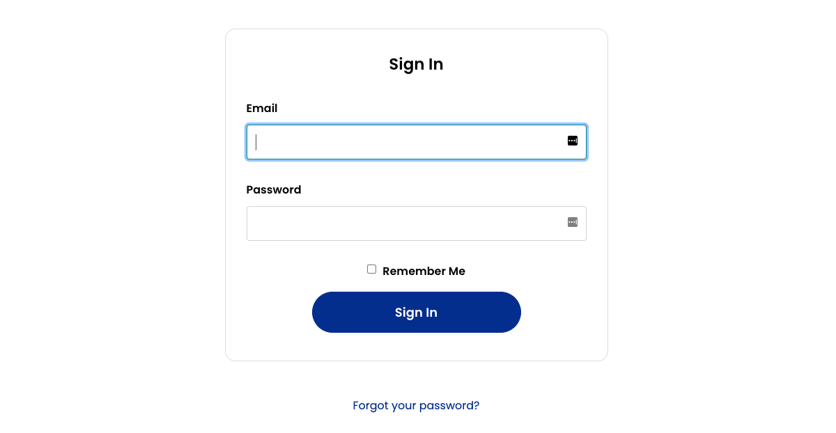
For simplicity, the following pages almost exclusively Bootstrap Cards and Bootstrap forms for formatting:
- Login
- Registration
- Forgot Password
- Resend Confirmation
Dashboard
Layout: 8-4 Content on the left, quick links to courses on the right.
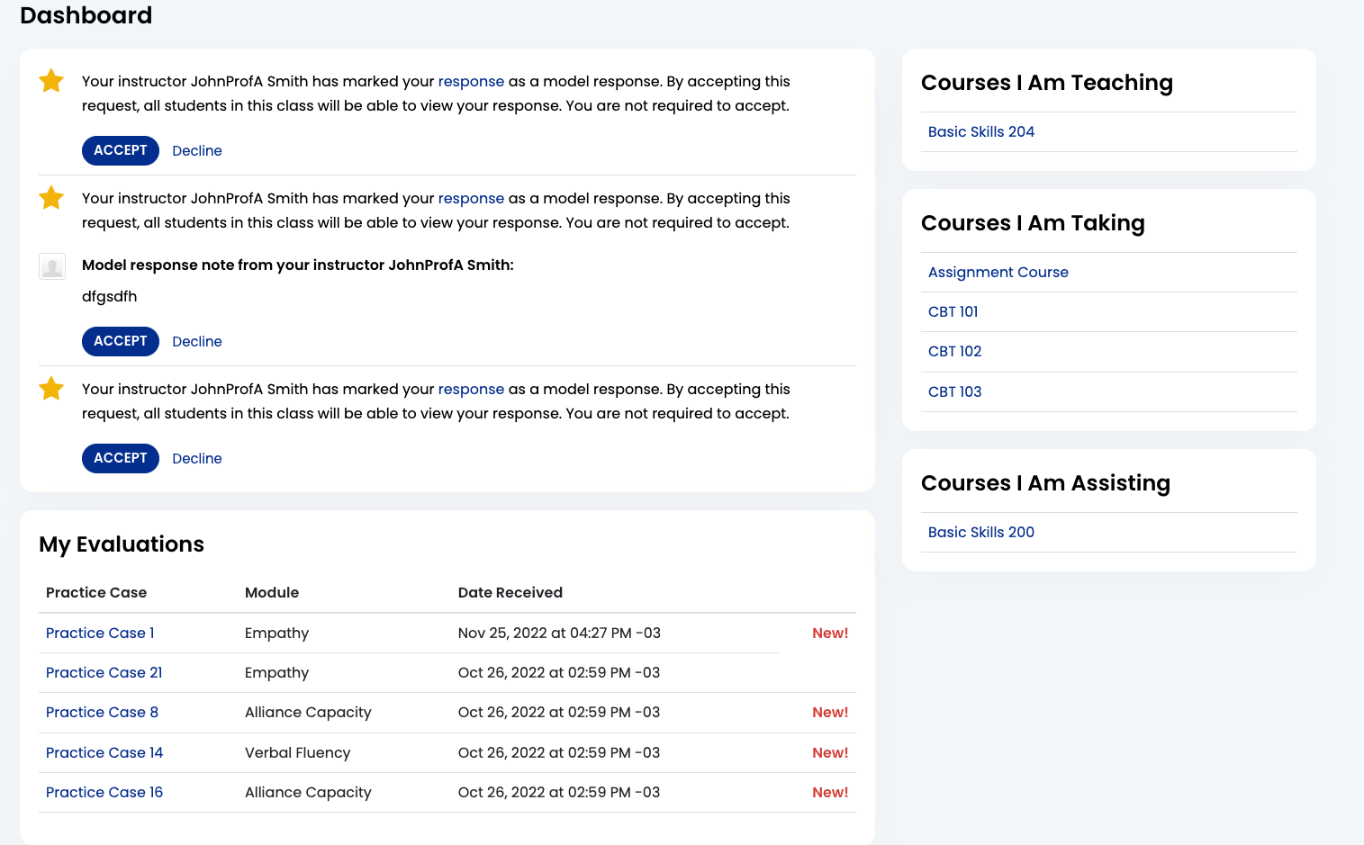
The dashboard contains information for the user about notificatons and new activity in their courses.
If any of these sections are empty of activity, the section is hidden to the user.
Model Response Request
Unactioned model response requests for the user. The user may accept or decline from the dashboard.
Course Invitations
Unactioned invitations to courses. Accepting a paid course invitations opens a popup stripe interface for paying for the course.
Declining a course removes the invitation entirely.
Recent Responses
A table listing for the 5 most recent responses for any course that the user is teaching.
My Evaluations
A table listing of the 5 most recent evaluations the user has received on their responses.
Courses
Red text on any of the below pages indicates an action a user can take. For example, viewing an evaluation or needing to evaluate a response. The red numbers may correspond to the number in the navigation, but may not if the user has ignored a response.
My Courses
Layout: 8-4. Content on left, right side empty.
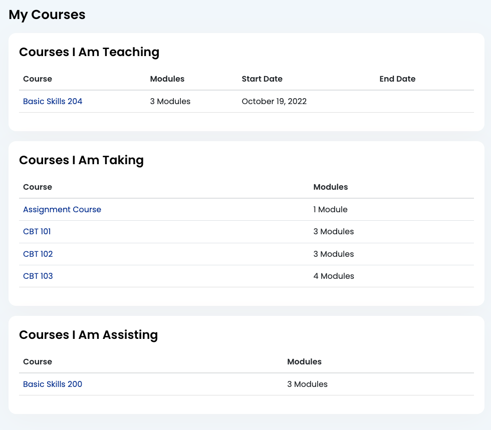
Gives an overview of the user's courses in plain table format. If the user is an instructor, lists the courses they are teaching first and allows them to create a new course, or delete an unpublished one.
Information included:
- Course name
- Modules
- Start Date
- End Date
Course Page
Layout: 8-4. Modules on left, course information and actions on the right.
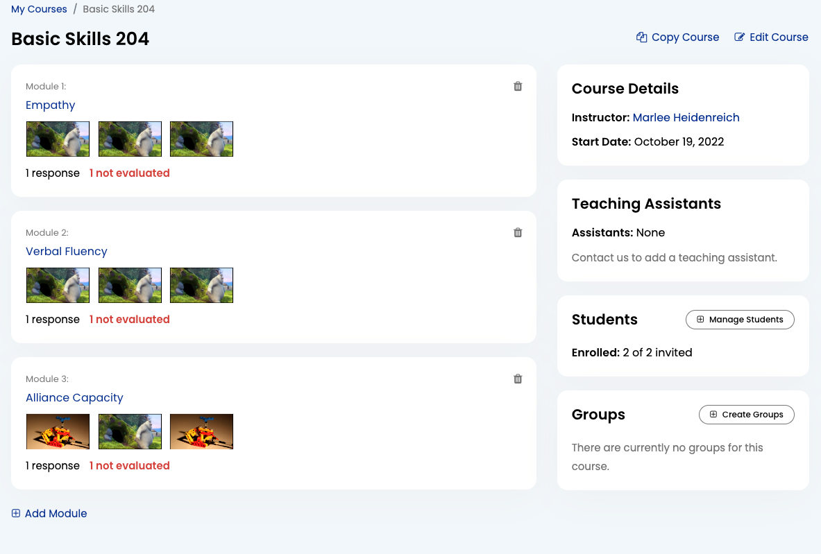
Instructor Only: The delete link for the module is placed outside the module link, just beneath it in the code. It should still be inside the listing-container div.
Module Page
Layout: 8-4. Course content on the left, default rubric on the right (instructors only).
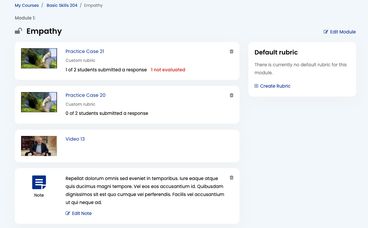
Types of module items:
- Practice Case (Individual or Group)
- Note
- Examples
Instructor Only: Add Module/Practice Case
Add Module:
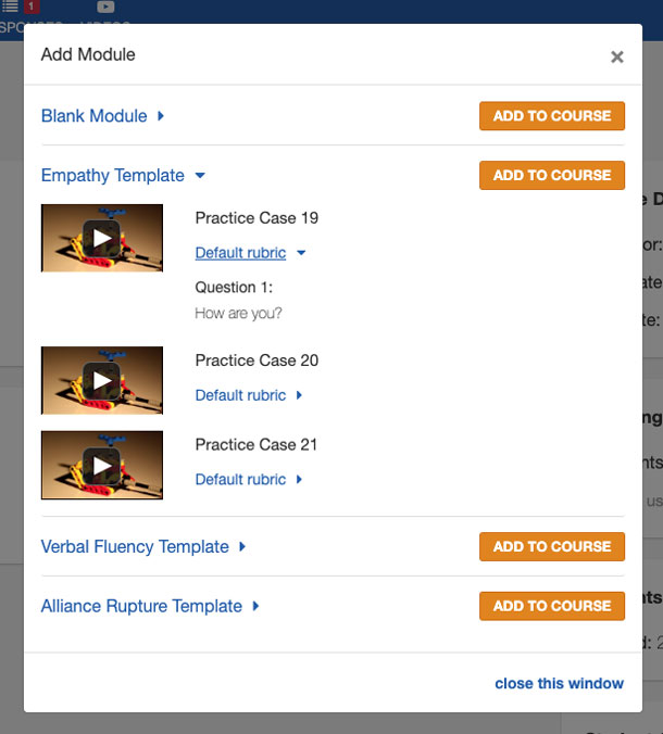
Add Practice Case:
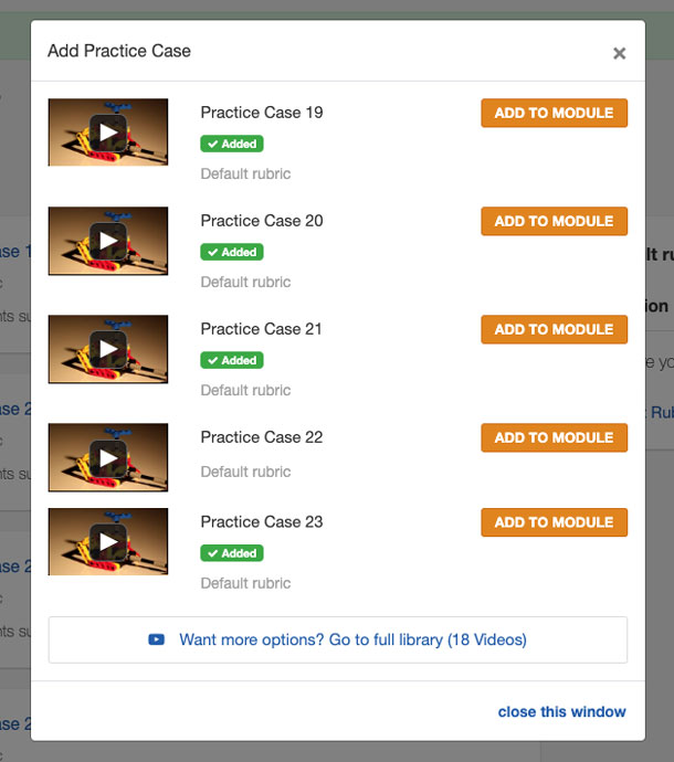
These views use Bootstrap's Collapse functionality to allow teachers to show and hide content as they please
The individual practice case view for both of these cards comes from the same partial, /views/case_studies/_preview.html.erb.
Instructor Only: Practice Case Page
Layout: 8-4. Practice Case content on the left, additional options and response list on the right.
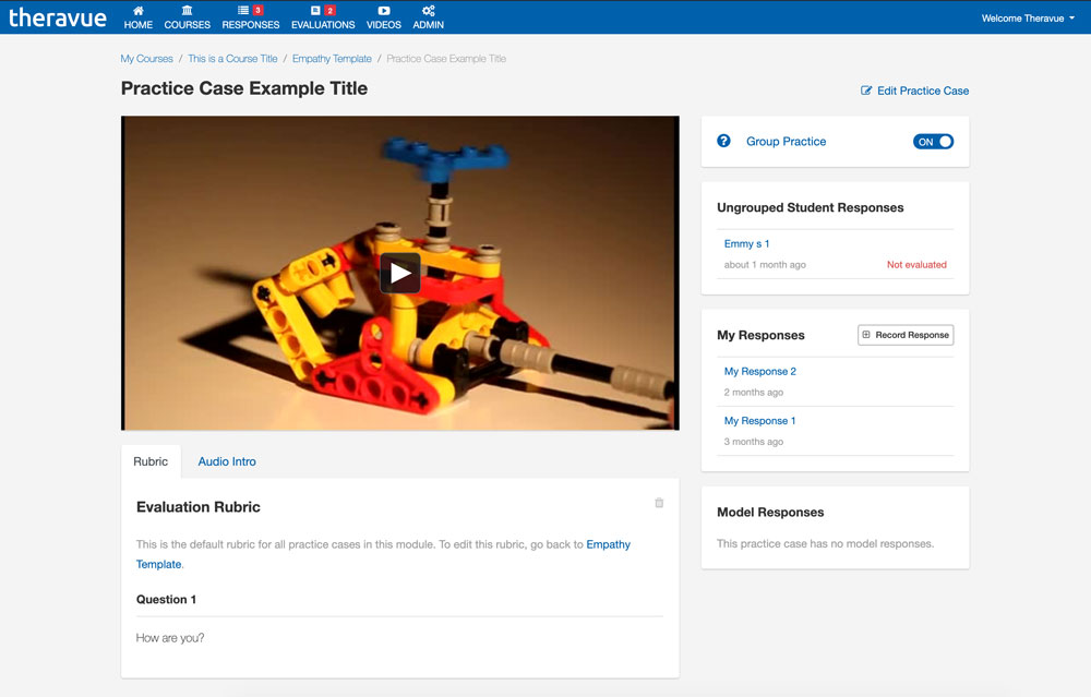
Left side:
- Stimulus Video
- Evaluation Rubric (inside tabbed navigation)
- Audio Intro (inside tabbed navigation)
Right side:
- Group Practice Toggle
- Student Responses (separated by group if applicable)
- My Responses (current user's responses)
- Model Responses
Students currently do not see this page and go straight to their newest response instead. If no response exists, they go to the Create Response page for the practice case.
Response Creation
Check Your Camera
Layout: Full width. All content inside a centered card.
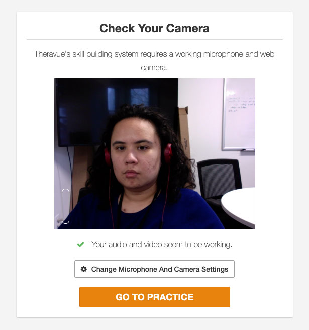
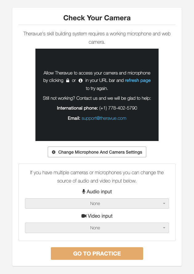
When working, displays the user's webcam feed.
If there is an error or permissions requirement, a message appears inside the box with additional instructions.
The button for the user to proceed is disabled until their camera and mic are working correctly.
Instructions
Layout: Full width. All content inside a centered card.
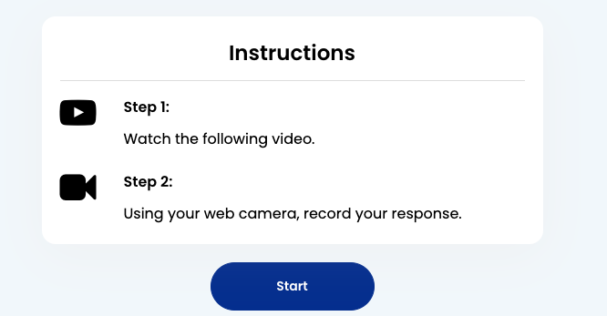
Instructions are kept short and simple, accompanied by a Fontawesome icon.
Create Response
The create response page comes in several stages. The Cameratag widget is highly customized-- see Cameratag Variables for more information.
-
Stage 1: Start Screen
Layout:
8-4. Left start button, right rubric.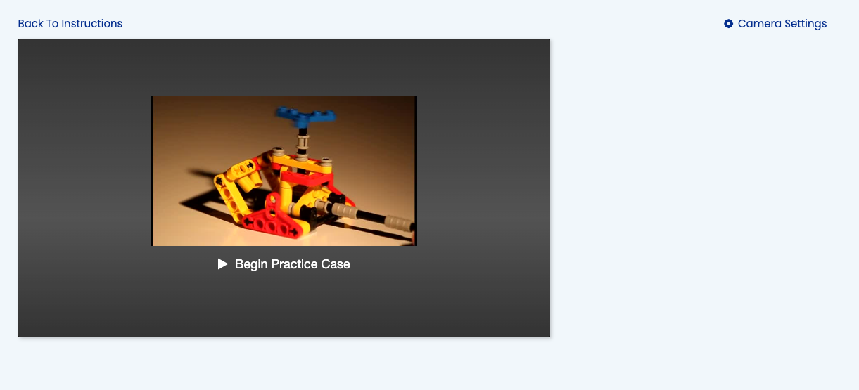
Clicking anywhere on the widget causes the practice case to begin.
-
Stage 2: Watch Stimulus video
Layout: Full width
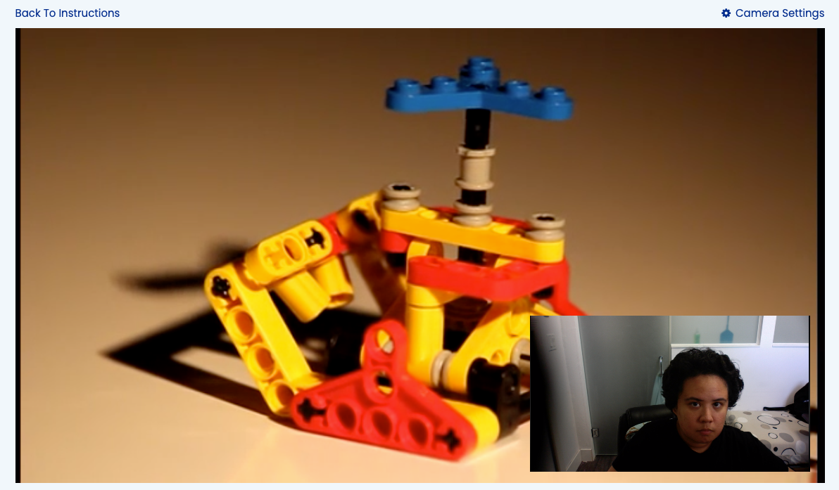
At this stage, a webcam feed appears of the user.
An audio intro plays, if present. After, a stimulus video plays. This stage may be skipped at any time.
When the stimulus video is finished playing, a countdown begins to record the response.
-
Stage 3: Response Creation
Layout: Full width
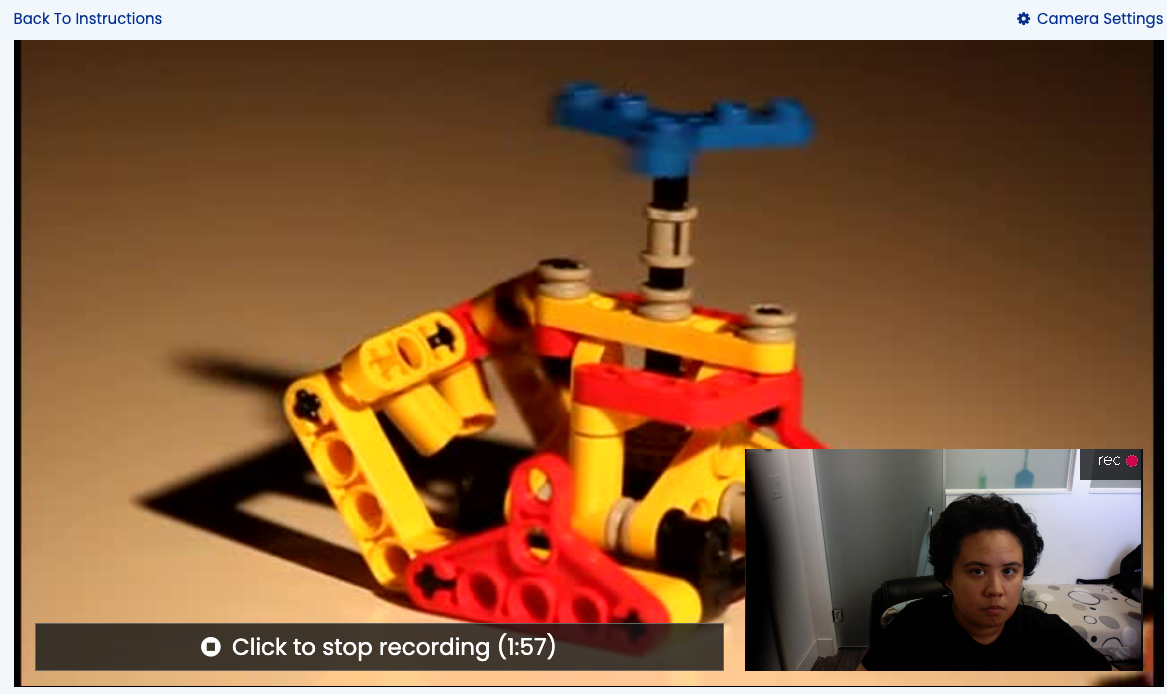
After at least 3 seconds have passed, the user may stop recording.
-
Stage 4: Self Evaluation
Layout:
8-4. Left video playback and evaluation. Right blank.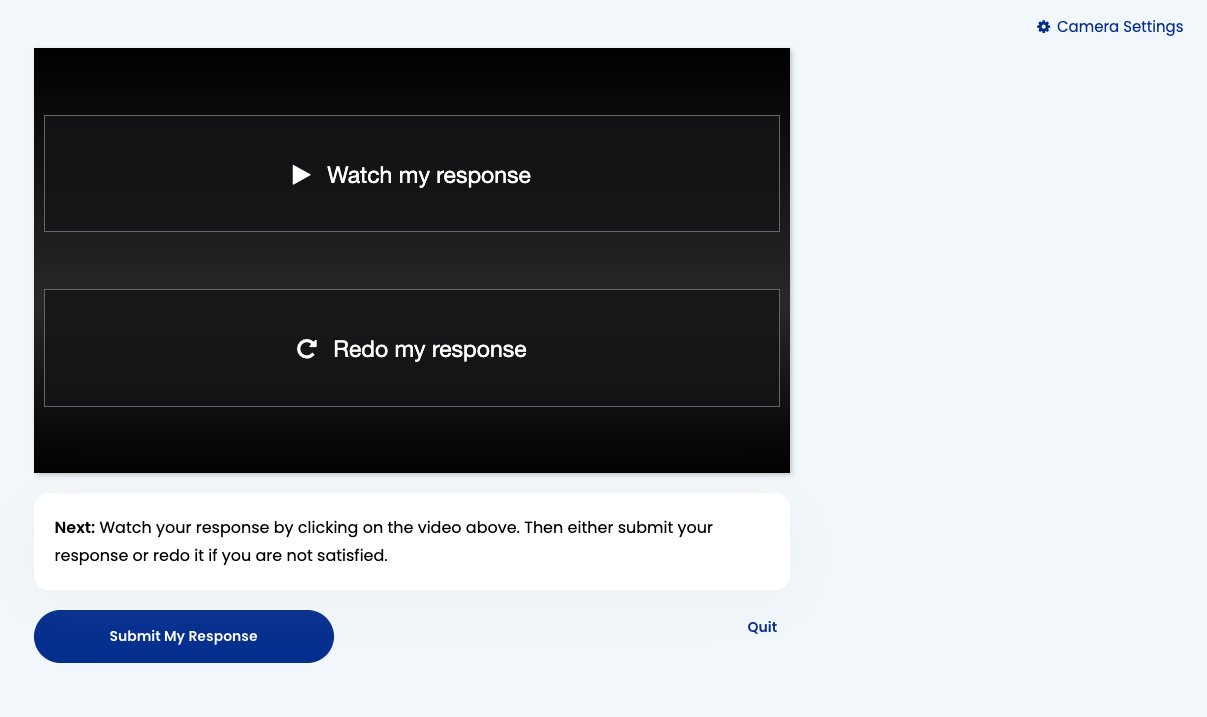
On the widget, two buttons are available to the user: Watch My Response and Redo My Response.
Below, the user gives a self-evaluation according to the practice case's rubric, if one is provided.
If there is an evaluation rubric present, the user may not submit their response until all questions are answered and self-evaluated as correct. This is to encourage users to practice their responses and improve their skills until they meet the criteria of the rubric.
Response Page
Layout: 8-4. Left response and evaluation(s), right sidebar nav.
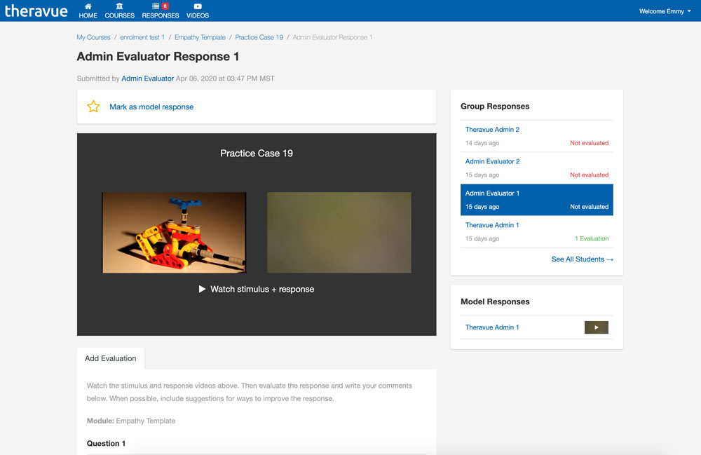
Created after a user submits their response to a practice case. The main function of this page is to display the practice case's stimulus video as well as the response in succession.
Left side:
- Response Info (title, date)
- Mark as Model Response (instructor only) OR Model Response Request (student only)
- Response widget
- Add Evaluation (instructors/TA's only)
- Evaluations (inside tabbed navigation)
Right side:
- Responses by This Student
- Responses from This Group (instructors only, if applicable -- dsables Responses by This Student box)
- Model Responses
Multiple Evaluations
Multiple evaluations become additional tabs. If the list exceeds the horizontal length of the column, the list will become scrollable.
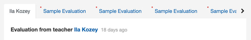
See Tabs for use details.
Actionable Lists (previously Notifications)
Responses:
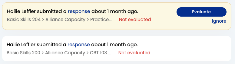
Evaluations:
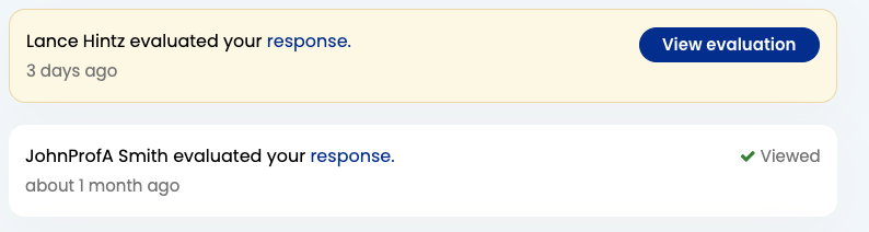
Unactioned items are highlighted with both a yellow background and blue button.
A response may be not evaluated with a white background and no button if the user has pressed the ignore link. Ignore links are not available for students, who are encouraged to look at all feedback.
Actions are specific to the user. If a user has an unactioned response notification, the status will not change if another user evaluates that response.
Stimulus Video Library
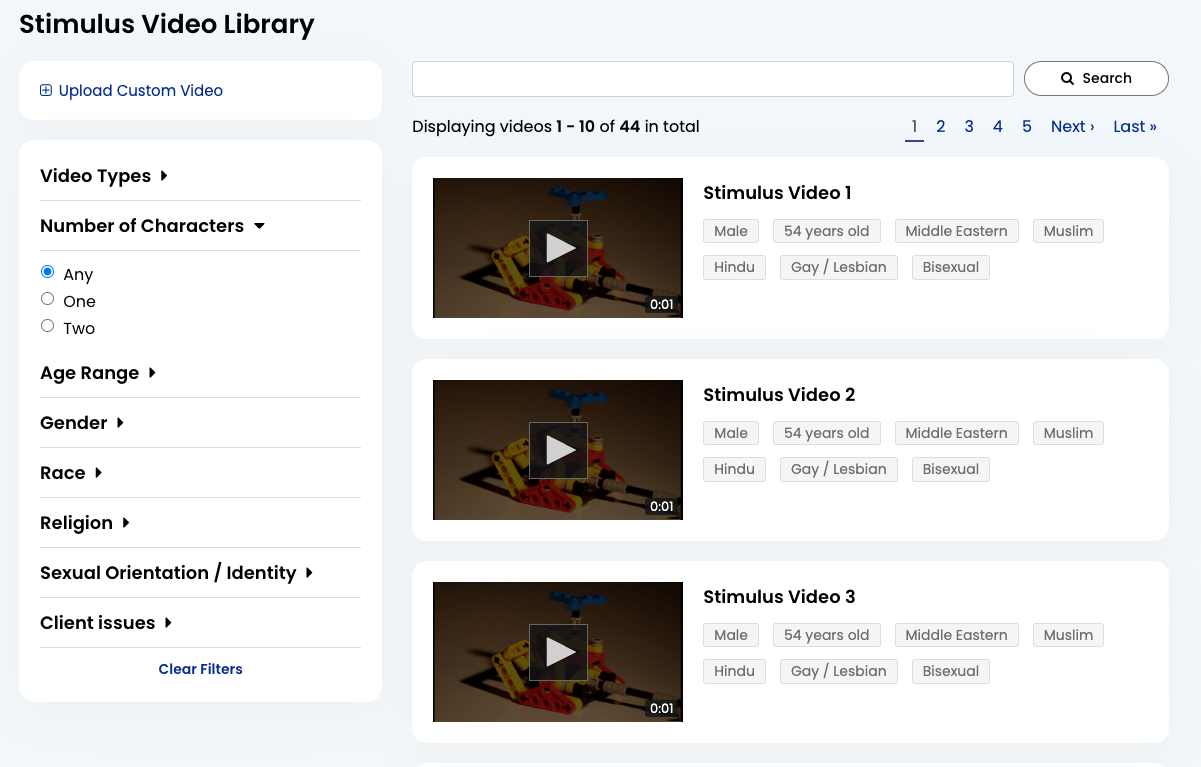
The video library is designed to help users easily browse Theravue's library of videos without having to go to separate pages to watch any one of them.
Filters
Applied asynchronously. Filter sections are collapsible to save space and give users a view of their options.
The tags seen next to each video are the video's filterable properties. Most are properties of the character, but any Client Issues are properties of the video.
Search
Finds words in the title of the video only.
Settings
Layout: 4-8. Left sidebar nav, content on right.
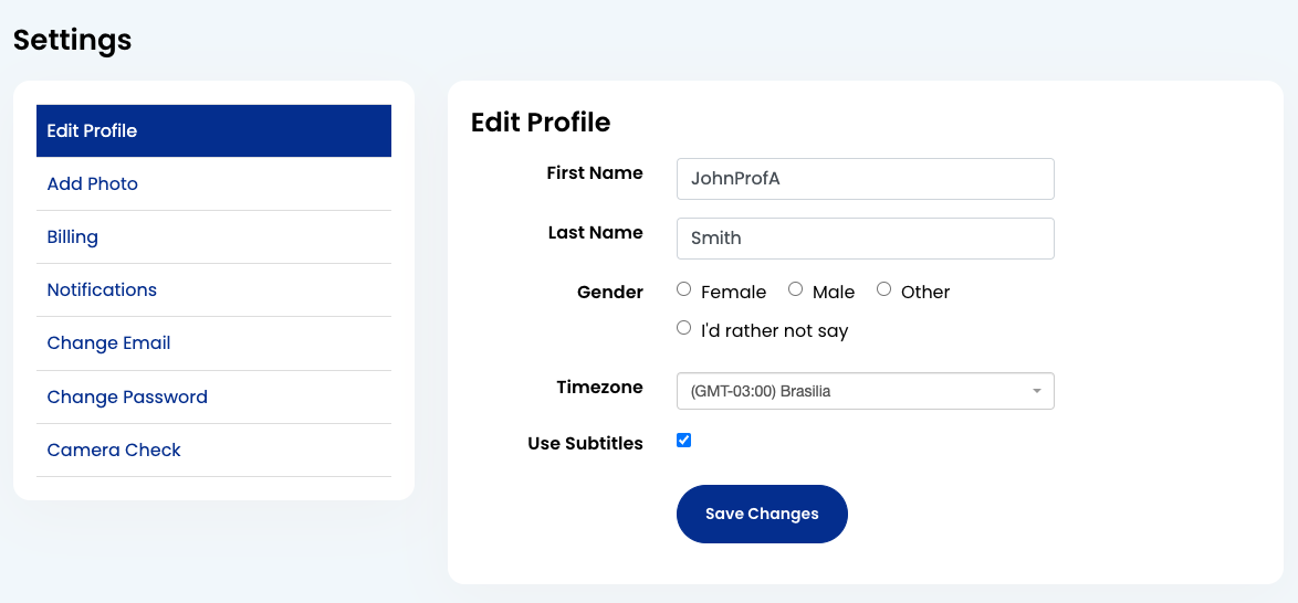
Edit Profile, Add Photo, Notifications
A simple form. Each field follows this format:
                    <div class="form-group">

                      <div class="row">

                        <div class="col-lg-4 col-xl-3">

                          <%= f.label :name, "First Name" %>

                        </div>


                        <div class="col-lg-8 col-xl-6">

                          <%= f.text_field :name, placeholder: "First name", autofocus: true, class: "form-control" %>

                        </div>

                      </div>

                    </div>
Billing
For now, a page with a single link to the payment history table. May be used for future billing features.
Change Email, Change Password
A more vertical form than the above, but still very simple. Follows this format:
                    <div class="form-group">

                      <div class="row">

                        <div class="col-lg-8 col-xl-6">

                          <%= f.label :password, "New Password" %>
                          <%= f.password_field :password, autocomplete: "off", placeholder: "New Password", class: "form-control" %>

                        </div>

                      </div>

                    </div>
Camera Check
See Response Creation. Uses the partial views/camera_tag/check_camera.html.erb
Help
Layout: 4-8. Help navigation on the left, content on the right.
The help pages contain information and instructions that all types of users may find useful. Images for visual aid should be added where helpful.
FAQ
The content of the main FAQ page is the same as the public FAQ page.
For Instructors
This section contains content relevant to instructors, mostly pertaining to building courses and managing students.
For Students
This section contains content relevant to students, such as instructions for creating responses.