Theravue Style Guide
CSS Syntax
Framework
Theravue uses the Bootstrap 4.3.1 framework for rapid development. Bootstrap's documentation can be followed for most utility styling.
Stylesheet Separation
All stylesheets are compiled into application.css. New stylesheets can be added or subtracted as needed to keep organization clean. All should be ordered as shown below:
-
Vendor Styles
Bootstrap and other third-party styles.
- ↓
-
Theravue Styles
Base styles (
application/theravueshould always be at the top of this section) - ↓
-
Media Query Styles
Listed by screen size (smallest → largest → retina)
Media Query Stylesheet
Styles inside each screen size have global and layout styles listed first, then each section in alphabetical order.
Formatting
element/#id/.class/ { a-property: x; b-property: x; c-property: x; }
Ideally (thought not necessary), properties should be listed in alphabetical order for easier reading. In some cases (ex. for positioning, top, bottom, etc.) grouping related or dependent properties together may be preferable.
Naming
Class names should be explicit, but not necessarily specific. For example, .edu-dashboard-widget is specific to the dashboard page, but can be re-used for multiple widgets for consistency.
Something like .edu-dashboard-widget-models may be too specific.
If necessary, use an additional class instead or an additional container inside the first, ie. class="edu-dashboard-widget models" OR edu-dashboard-widget > model-response.
Nesting
Can be altered as necessary for readability. Keep nesting to one level if possible, never more than two.
Variables & Mixins
Variables and mixins used in each stylesheet are posted to the top and can be added as necessary. If the variable is no longer being used inside that particular stylesheet, it can be safely removed from the top section of that sheet's variable listings.
Some variables and mixins may change in media queries.
Color Variables
                    $primary: #042E8E;

                    $secondary: #453799;

                    $accentone: #008DD1;

                    $body: #000;

                    $muted: #757575;

                    $success: #388038;

                    $danger: #D4403A;
See Branding - Color Palette for details of use.
Border Radius Variables:
                    $radius: 15px;

                    $btnradius: 30px;
If an element has rounded corners, the top variable should always be used.
Buttons use the bottom variable for their radius to differentiate them from regular element rounded corners.
Box Shadow Variable:
$shadow: 0 12px 54px 0 rgba(221,187,168, 0.1);
Should always be used on outer container elements. Usually applied automatically with @include contentbox; mixin.
Animation Mixin:
                    @mixin animation {

                      transition: background-color ease .3s, border ease .3s, box-shadow ease .2s;

                      -webkit-transition: background-color ease .3s, border ease .3s, box-shadow ease .2s;

                      -moz-transition: background-color ease .3s, border ease .3s, box-shadow ease .2s;


                    }
CSS Include:
@include animation
A subtle animation is used on hover links that encompass the entire contentbox, rather than just text.
Contentbox Mixin
@mixin contentbox { background-color: #fff; border: 1px solid #ddd; border-radius: $radius; margin-bottom: 20px; padding: 20px; }
class="contextbox"
@include contentbox
Similar to Bootstrap's card class in appearance, contextbox adds a white background and padding around main sections of content. However, unlike Bootstrap's class, contentbox does not require extra HTML formatting according to the header, body, etc.
On medium-sized screens, a border and shadow are added to contentbox.
The Bootstrap card class can still be used as written in their documentation if needed.
Active State Mixin:
@mixin active-state { background-color: $primary!important; color: #fff; }
CSS Include:
@include active-state
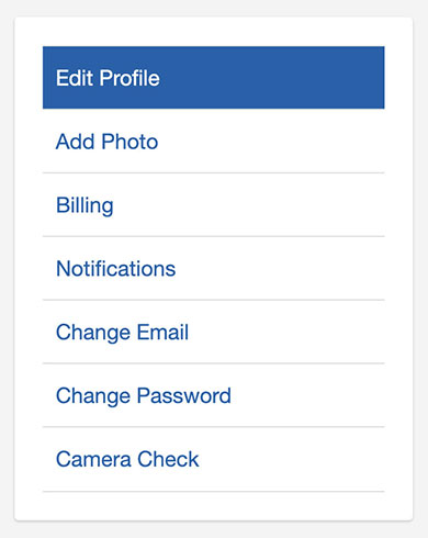
Indicates a selected element or page by adding a blue background and white text.
Example:
Cameratag Variables
$ct_btn_fontsize Controls button font size.
$ct_btn_fontsize_lg Controls large button font size.
$response-widget-inactive-width Controls width of user webcam display.
$response-widget-inactive-height Controls height of user webcam display.
$response-widget-inactive-border-size Controls border of user webcam display.
$response-widget-recording-row-margin Controls margins around user webcam display.
Cameratag Mixins
Mixins:
                    @mixin cameratag_button {


                      background-color: rgba(19,20,21,0.8)!important;

                      font-size: 15px;

                      font-weight: 400px;

                      color: #fff!important;

                      border: 1px solid #666!important;


                    }
                    @mixin cameratag_button_hover {


                      background-color: rgba(0,0,0, 0.9)!important;

                      border: 1px solid #666!important;

                      text-decoration: none;


                    }
CSS Includes:
@include cameratag_button
@include cameratag_button_hover
These two mixins control the appearance of custom Cameratag buttons in various response widgets.