Theravue Style Guide
Navigation
All Navigations
Tag any navigation link lists with role="list" on <ul>. Every <li> inside should have the attribute role="listitem".
Public Navigation
Contained inside the <header> tag.
The public navigation should be as simple and professional as possible. Users should be encouraged to sign up for a demo as the main CTA.

Adding Links
Place new links in the layout/public_nav.html.erb file inside the <ul class="navbar-nav"> element.
Nav Format:
                    <nav class="collapse navbar-collapse justify-content-md-end" id="public-nav-toggle">

                        <ul class="navbar-nav" role="list">

                          <li class="nav-item <%= 'active' if public_highlight?('/page') %>" role="listitem">

                            <%= link_to page_path, class: 'nav-link' do %>

                              <span>Page</span>

                            <% end %>

                          </li>

                        </ul>

                    </nav>
User Navigation
Contained inside the <header> tag.
The user navigation should allow users to easily find the main sections of the site.
Each main link should have a Fontawesome icon to visually distinguish it from the others. Because FA icons may differ slightly in size, individual icons may have small size adjustments.


Home: Available to all users. Goes to Dashboard.
Courses: Available to all users. Goes to list of courses the user is in.
Responses: Available immediately for instructors. Students must have at least 1 actionable response for this link to appear. May have a red badge indicating the number of unaction responses.
Evaluations: Link does not appear for any user type until they have received at least 1 evaluation. May have a red badge indicating the number of unactioned evaluations.
Videos: Available to instructors only. Goes to the video library for browsing and uploading custom videos.
Admin: Available to admin only. Goes to ActiveAdmin.
Adding Main Links
Links can be added directly to the layout/_user_navbar_links.html.erb file. If the links is intended to be non-collapsible, add it to the layout/_user_nav_links_static.html.erb
                    <li class="nav-item <%='active' if highlight?('page_path') %>" role="listitem">

                      <%= link_to page_path, class: 'nav-link' do %>

                        <i class='fa fa-icon' aria-hidden='true'></i>
                        <span>Page</span>

                      <% end %>

                    </li>
Adding User Dropdown Links
Links can be added directly to the layout/_user_links.html.erb file.
                    <%= link_to link_path, class: "dropdown-item #{'active' if highlight?('settings')}" do %>

                      <span>Settings</span>

                    <% end %>
Side Navigation
Follows the Bootstrap Vertical Nav format. Collapses on mobile views.
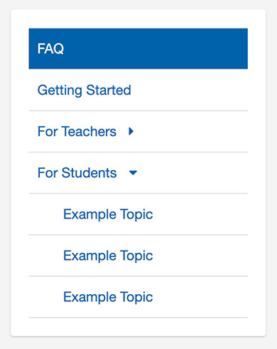
Collapsible Sections: Follows Bootstrap Collapse formatting. Used for side navigation subtopics.
Format:
                    <li class="nav-item">

                      <%= link_to "#", class: "nav-link #{'active' if nil}", role: "button", data: { toggle:"collapse", target:"#collapse1" }, aria: { expanded: "false", controls: "collapse1" } do %>

                          <span>Link Name</span>

                          <i class="fa"></i>

                      <% end %>


                      <ul id="collapse1" class="collapse">

                        <li class="nav-item">

                          <%= link_to "Example Subtopic", "#", class: "nav-link #{'active' if nil}" %>

                        </li>

                      </ul>

                    </li>
Correct carets will be added automatically by following the format above.