Theravue Style Guide
Elements & Utilities
Alerts
All alerts follow Bootstrap Alert formatting. Appears at the top of the screen just under the navigation, except on the regristration page.
Alert classes used on Theravue currently:
alert alert-success Confirmation for a user when their action is completed.
alert alert-danger Notification for a user that their action has failed or there is an error.
alert alert-warning Other urgent notices to the user that are not confirmations, failed actions, or errors.
Example of a properly written alert:
                    <p class="alert alert-success" role="alert" aria-live="polite">
                      Action completed sucessfully.
                    </p>
Or:
                    <p class="alert alert-success" role="status" aria-live="polite">
                      Action completed sucessfully.
                    </p>
role="alert" is used to convey a time-sensitive message to the user on assistive technology.
role="status" is used to convey non-time-sensitive information about an action to a user on assistive technology.
aria-live="polite" Tells screen readers to automaticfally read out this text when everything of a higher priority has been read out.
Dismissible Alerts
Follow Bootstrap Dismissible Alerts format.
Error Messages
Example of a properly written alert:
                    <p class="alert alert-danger" role="alert" aria-live="assertive">
                      Action had an error.
                    </p>
aria-live="assertive" Tells screen readers to prioritize reading this information when there is a change to the space inside.
Asynchronous Updating Elements
For any alert, status messages, or changes to results (ie. number of pages) that appear asynchronously on the page while updating, the attribute aria-live=assertive" must be added to the element explaining the update. It does not need to be added to every updated element.
aria-live="assertive" will tell the screen reader to read this section to the user when a change happens within it.
For alerts, and errors specifically, role="alert" should be added to the message as well.
Breadcrumbs

The current active page must have both attributes class="active" and aria-current="page" to display correctly for both visual and screen readers.
Buttons
Mostly used as described in Bootstrap Buttons with some small differences.
Although links can be styled as buttons, actual <button> tags should perform some kind of action.
Primary Buttons
<a class="btn btn-primary">Primary Button</a>
Used for the main call to action on a page. Preferably, no more than one per page.
<a class="btn btn-outline-primary">Non-CTA Button</a>
Used for buttons that are not calls to action on marketing pages.
Secondary Buttons
<a class="btn btn-outline-dark">Secondary Button</a>
Used for actions a user can take that would add to a list of items.
Disabling Buttons
Used when pressing a button twice could have an undesirable result, ex. an extra form submission. Upon clicking, disables the button to prevent further clicks and adds a spinner to show the user the action is being completed.
Format:
<%= render partial: 'utilities/disabling_button', locals: { button_id: 'buttonidname', button_class: 'classname', button_type: 'submit', button_content: "Button Text" } %>
button_class: only requires btn-primary or btn-secondary. The btn class is added automatically.
Note: Forms using the disabling button should have the class chrome-disabling-form-fix on the form tag. There is a Chrome bug that causes the form to attempt to submit twice when a disabling button is clicked. This class prevents the form submitting twice.
Button Utility Classes
btn-sm Reduces padding and shrinks font size.
xs-cta Mobile styling used exclusively on public pages to make the signup link as easy as possible to find.
btn-link In some cases, it may be desirable to have a button visually similar to a link.
Contentbox
See Contentbox in Variables and Mixins for details and use.
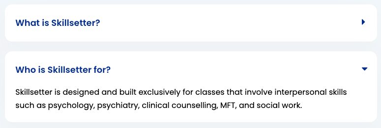
Collapsibles
Collapsible elements (ie. FAQ questions) follow Bootstrap Collapsible formatting with a few minor additions.
Usage:
                    <a data-toggle="collapse" href="#example-collapsible" role="button" aria-expanded="false" aria-controls="example-collapsible">

                      <h2>Collapsible element header (can be any header level)</h2>

                      <i class="fa" aria-hidden="true"></i>

                    </a>

                    <div id="example-collapsible" class="collapse">

                      <p>Collapsible element content.</p>

                    </div>
Note that the fontawesome icon does not need any additional classes and will change carets automatically using this formatting.
Forms
Each input field should have a label tag to accompany it.
Format Example:
                    <input type="radio" value="female" name="user[gender]" id="user_gender_female">
                    <label for="user_gender_female">
                      <span class="sr-only">Gender:</span>
                        Female
                    </label>
Format Example 2:
                    <label for="q_characters_gender_id_in_2">
                      <input type="checkbox" value="2" name="q[characters_gender_id_in][]" id="q_characters_gender_id_in_2">
                      Female
                    </label>
Either are correct.
Do not use placeholder text as a substitute for labels. Screen readers cannot read placeholders. It is also problematic for visual users to have to clear the box to read what the input field is for.
Authentication Forms
Add aria-required="true" to any required fields on authentication forms (Login, Register, Change Email, Change Password, etc.).
Headers
Headers should function normally as elements. For screen reader accessibility, they should follow a strict heirarchical order and should never be displayed if empty.
As described in Bootstrap headings, classes for headings are also available for when headings need to visually match a different style of heading.
Example:
h1 class="h3"
Headers with Links

Displays a link (or links) adjacent with the header of the page.
Usage:
                    <div class="header-with-links clearfix">

                      <h1 class="float-left">

                        <%= @title %>

                      </h1>


                      <%= link_to "#", class: "course-action icon-link" do %>

                        <i class="fa fa-pencil" aria-hidden="true"></i>

                        <span>Link</span>

                      <% end %>

                    </div>
Usage with multiple links:
                    <div class='d-lg-flex header-with-links clearfix'>

                      <h1 class="float-left">

                        <%= @title %>

                      </h1>


                      <div class="flex-grow-1 align-self-end text-lg-right">

                          <%= link_to "#", class: "course-action icon-link" do %gt;

                            <i class='fa fa-copy' aria-hidden="true"></i>

                            <span>Copy Course</span>

                          <% end %>

                          <%= link_to "#", class: "course-action icon-link" do %>

                            <i class='fa fa-pencil-square-o' aria-hidden="true"></i>

                            <span>Edit Course</span>

                          <% end %>

                      </div>

                    </div>
Images
Format:
<%= image_tag "image.jpg", :alt => "" %>
Images should always have an alt="" attribute, even if it is left empty. When filled, this attribute provides visually impaired users information about the image. Leaving it present and empty stops screen readers from reading out the URLs of images.
It is not necessary to fill this tag with redundant information. For example, if the photo is of a user's avatar and the user is labeled by name in text next to it, the alt attribute should be left blank.
The alt attribute will not work on non-image elements. Use class="sr-only" for accessibility on other elements.
Note: Cameratag-generated thumbnails do not seem to have a way to add an alt attribute.
Image Files
Save images as .jpg to keep loading times light. Avoid load-heavy .png images unless transparency is required.
For optimal quality and size, follow these steps in Photoshop CC:
- Open the image.
- Go to File > Export > Save for Web (Legacy).
- Set the preset on the top right to JPEG High (60 quality). It does not matter if the image is meant for retina display or not. Why? 60 is the point at which quality stops making a significant visual difference to users.
- Set image dimensions.
- Save image.
Retina Display Images
Retina display images should be provided for tablets (>768px, md bootstrap size) and up.
Retina images must be 2x the size of its counterpart on a regular screen.
If the retina and non-retina variations are very close in byte size, only use the larger one for both variations (this is more common in very small images).
Retina images will not have an impact on non-retina loading times if implemented properly. Use a CSS background image for each variation in media.css.scss.
Format:
.examplediv { background: image-url('imagename.jpg'); }
Retina display only styles should go at the bottom of the media.css.scss stylesheet.
Format:
                    @media
                    (-webkit-min-device-pixel-ratio: 2) and (min-width: 768px),
                    (min-resolution: 192dpi) and (min-width: 768px) {

                      .examplediv { background: image-url('imagename-x2.jpg'); }

                    }


                    @media
                    (-webkit-min-device-pixel-ratio: 2) and (min-width: 992px),
                    (min-resolution: 192dpi) and (min-width: 992px) {

                      .examplediv { background: image-url('imagename-x2.jpg'); }

                    }


                    @media
                    (-webkit-min-device-pixel-ratio: 2) and (min-width: 1200px),
                    (min-resolution: 192dpi) and (min-width: 1200px) {

                      .examplediv { background: image-url('imagename-x2.jpg'); }

                    }
NOTE: When implementing retina images, properties of the background image will not be inherited from previous size's styles and must be defined again.
Links
Links inside paragraphs must be underlined for accessibility.
For the most part, links should function on screen readers without issue.
Labelling Links
For links that do not provide clear text of the page or action they trigger (ie. fontawesome icon-only links), an aria-label or aria-labelledby attribute must be provided to give clarity to screen reader users.
Links vs Buttons
Links should take users to a new page.
For links that instead trigger an action, popup, etc, use the <button> tag instead or role="button" if that isn't possible.
JAWS: JAWS screen reader has difficulty reading out links that are containers, such as course module links:
Combination Solution:
Use
role="link"on the link tag to help screen readers detect this linkIf appropriate, add
<span class="sr-only">Go to</span>in front of the main item text.
See Cameratag Accessibility for a separate solution to Cameratag player and widget buttons.
Course Action Links

Adds consistent styling to links relating to the course creation.
Format:
<%= link_to 'Link title', '#', class: 'course-action' %>
Icon Links
For links with a Fontawesome icon beside it. These links are typically associated with an action the user is trying to complete, rather than just directing the user to another page.
Also see above, Labelling Links.
Format:
                    <%= link_to '#', class: 'course-action icon-link' do %>


                      <i class="fa fa-x" aria-hidden="true"></i>

                      <span>Link Title</span>


                    <% end %>
Full width course action links
For standalone course action links. Makes the link fullwidth, adds contentbox styles and some padding changes.
Format:
<%= link_to 'Link title', '#', class: 'course-action course-action-fullwidth' %>
Lists
Use lists where applicable, but if the content is not specifically a list, a <div> is preferred for screen reader accessibility.
Muted Text
Gives users extra information or instruction. Requires two classes.
Example text.
Usage:
class="text-muted text-note"
text-muted is a Bootstrap class with Skillsetter-defined color.
text-note controls the size and weight of this text.
Tables
For screen reader accessibility, avoid using tables when possible. Screen readers can navigate them but they're less fluid than reading other formats. <div> is preferred, or lists.
Format:
                    <table class='table'>

                      <caption class="sr-only">This is the purpose of the table.</caption>

                      <thead>

                        <tr>

                          <th>Table header</th>

                        </tr>

                      </thead>


                      <tbody>

                        <tr>

                          <td>Content</td>

                        </tr>

                      </tbody>

                    </table>
Tables should always include a caption describing the purpose of the table. class="sr-only" should apply to most of Theravue's use cases.
Empty table headers should not be displayed.
Tabs
Uses Bootstrap's Tabs component with the rails-bootstrap-tabs gem for dynamic formatting.
For the active tab link, add the attribute aria-current="true".
Scrolling Tabs
Scrolling tabs are custom to Theravue and require a div with the class scrolling-tabs encompass a tabbed navigation, scroll buttons, and tab content.
Format:
                    <div class="scrolling-tabs">

                      <%= tabs content_class: 'contentbox' do |tab| %>

                        <button class="scroller float-left">

                          <i class="fa fa-chevron-left"></i>

                        </button>

                        <button class="scroller float-right">

                          <i class="fa fa-chevron-right"></i>

                        </button>


                        <% tab.tab "Tab Name" do %>

                          Tab content

                        <% end %>

                      <% end %>

                    </div>
Thumbnail Placeholders
This class, when placed around an image, holds its height, preventing jumpy loading of images for the user.
Adding the thumb class on a div around around an image or Cameratag element should work in most cases. A height adjustment may be required.
Format:
                    <div class="thumb">

                      <img src="img">

                    </div>